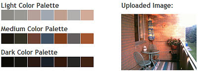
I will use home decorating as the example for this post. I'm redoing my deck and want the colour scheme to complement the existing fixed elements such as the bricks and the balcony. I also want to do it on the cheap and incorporate some of the existing furniture. There are many ways I could do it.
I could upload a picture of the deck into the Colour Palette Generator to produce a colour palette before I choose the paints that I will use to refurbish. You can also save the palette to a CSS style sheet or a Photoshop 'aco' file.

I could go to the Colour Scheme Designer and select a dominating colour of the deck in the mono palette and then look at the complementary, triad, tetrad, analogic and accented analogic colour palettes to see which works. There is also the option of adjusting the scheme for saturation & brightness.
COLOURlovers web site is a colour & design community for creative inspiration; a good place to go to see the current colour trends and associated colour palette choices.
To see if your colour palette works in real life settings, you can use the Idée Inc. Multicolr Search Lab. Pick the colours that most closely match your palette choice and it will generate a collection of photos that use those colours.
Colours can create moods, have emotional associations, and make subliminal statements. There is a page on the Color Wheel Pro web site that explores the meanings ascribed to different colours.
Color Wheel Pro also has a page that gives examples and discusses the classic colour schemes such as monochromatic, analogous, complementary, triadic, and tetradic.
Color Blindness Tests provide two online tools: colour arrangement and the RGB Anomaloscope. These can help in determining whether you are hampered by colour blindness.
Once you determine your colour palette, the Benjamin Moore web site provides an online tool called the Personal Color Viewer that allows you to upload a picture of your intended project space. Then, on the second tab, you can select colours by moving the slider so you can see an approximation of the result. It gives the choice of the names or the numbers of their particular paints to order.
If you want to know more about the theory of colour, here are two good links to help you expand your knowledge.
Color Worqux provides a detailed tutorial on color theory.
Color Contrast & Dimension in News Design is an interactive educational project.
No comments:
Post a Comment
Any comments that exceed the barrier of good taste will be deleted. I reserve the right to arbitrarily decide.